Whether you’re new to the hearing health industry or have been around for a while, you’ve probably heard people say that building a strong brand standard is important. But what does that mean? Many people believe that a logo is the only thing they need. These people would be very wrong. There are several benefits to developing a solid brand, which is why this Ask Fuel First section asks the following question: Why should I develop a brand standard?
Developing a consistent brand standard takes effort from everyone at your practice, but the results are worth it. Before we get into the details of why, we want to show you what a solid brand looks like.
A Solid Brand
If you Google “REI advertisement,” you’ll probably get results similar to those in the image below.
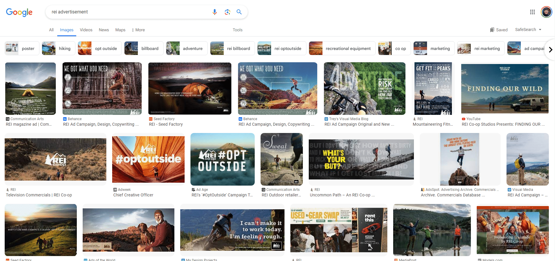
Looking at this collection of REI advertisements, we notice several aspects that lead us to believe that REI has a solid brand, including the following:
- Consistent color scheme: REI uses earth tones in all its ads, such as green, blue, brown and orange variations.
- Similar font styles and sizes: They use large fonts that are either white or yellow. Although there is a little variety in the fonts they use, they’re mostly bold sans-serif fonts shown prominently in each ad.
- Pictures highlighting the outdoors: The style of photography is similar in that each ad shows people enjoying themselves in a natural landscape. These aspirational images tend to spark an emotional response. Many people will think that they’d rather be outside having fun than what they’re currently doing.
- Models that reflect their customer base: The pictures all show young to middle-aged, physically fit adults having adventures outdoors—camping, hiking, biking, etc. These models reflect their customer base.
All of these elements point to a solid brand. As a company that sells outdoor equipment, clothing and accessories, REI has a brand aesthetic that matches its identity. The company’s website says, “At Recreational Equipment, Inc. (REI), we believe a life outdoors is a life well-lived!”(REI.com), and this is precisely what we see in their ads.
REI made conscious choices about its brand and stayed consistent throughout its ads. If you look at the Google results page again, you see cohesion, where individual ads make up a single collection. This cohesion is also evident if you navigate to REI’s website or visit one of their locations.
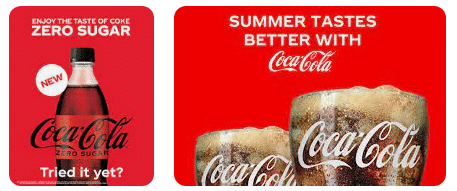
When you compare REI to another company, Coca-Cola, for example, you can see how each company has a different look and feel for its brand. However, both brands understand three principles for developing a solid brand: clarity, consistency and constancy.
Clarity
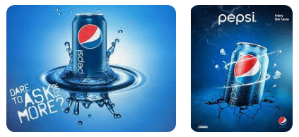
When you’re developing your brand, you must be clear as to who you are. The look and feel of your print materials, website and messaging give you two advantages for clarity. First, your brand differentiates you from your competition. Take Coke and Pepsi, for example. Even though they both sell drinks, the look and feel of their brands are different.
Secondly, your brand creates connections with patients. You give them an idea of who you are and what you stand for, which translates into trust. This trust can also be the catalyst for attracting top talent to your practice. Job seekers who make an emotional connection with your brand are more likely to apply for a job.
Consistency
Your patients know who you are and what to expect based on the consistency of your brand. They’re emotionally connected to your brand. Your website, digital assets and printed materials should have cohesion so it appears that each part makes up the whole—just like we noticed in the REI ads. That means deciding on a consistent color scheme, font styles and types of images that appear on your materials.
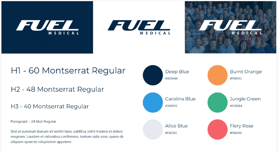
Fuel Medical has 100+ employees who represent our company. For this reason, we’ve developed a guide to our brand standard. Anything associated with Fuel’s brand should follow the guidelines shown below. Consider developing something similar for your practice to maintain consistency.
Constancy
Once you’ve established your brand aesthetic, stay with it. Your patients will know who you are and what you stand for because that’s reflected in your brand. The last thing you want to do is throw your patients a curveball. If they visit your website and see a complete change, it will cause some confusion. They’ll wonder if this is the same practice that they’ve been dealing with, causing a level of distrust. There are times when you might choose to rebrand your practice, but this should be extremely rare because you’ll have to rebuild connections with your patients, which takes time.
One aspect of maintaining a solid brand aesthetic is that it will bring you more opportunities. Again, people know who you are and what to expect. Practices that display this level of professional consistency can often charge more money for their services. Think about it. If you see a website that uses a variety of colors with no theme, several different font styles and sizes without some sort of logic and different sizes and types of images, you might wonder about that practice’s level of professionalism. In the healthcare industry, you may even be concerned for your safety. Conversely, when you see a website that looks professional and has a solid brand aesthetic, you’ll be more likely to call and make an appointment because there’s a basic level of trust already established. Patients will also consider paying premium costs because they trust the practice.
Similarly, imagine a patient going into a practice and mentioning an ad that they saw recently, and the employee says, “Oh, yeah, I saw that one, too. I hate it.” That employee has sown a seed of distrust. The patient may think, “If the employees of a practice can’t even agree on their messaging, what else do they disagree about?” And if anything else seems to be “off” during their visit, they may consider finding a new practice for their care.
Why Should You Build a Strong Brand Aesthetic?
You should build a strong brand aesthetic because it creates a sense of trust with your patients. When you’re intentional about creating a solid brand, they’ll know who you are and what you stand for. Of course, employees must stand behind your brand, but having meaningful and consistent visuals is a start to building trust.
You should also consider building a strong brand aesthetic because it sets you apart from other practices. Patients will recognize the cohesion between your website, materials and office location because they will bear your logo and align with the standards that you’ve created. When you demonstrate a high level of professionalism, your patients may be willing to pay premium prices because they know they’ll receive quality care.
How Can You Get Started?
To establish your own brand aesthetic, consider the following:
- What colors will you use? Select a range of colors that establish a theme.
- What fonts will you use? Be sure to identify styles/sizes for different purposes, such as titles, paragraphs and side notes.
- What type of images will you use? Images could include still-life photos, illustrations and graphics.
- Do your online and printed assets follow your brand standards? This includes your website, emails, marketing materials, etc.
- Does your office reflect your brand standards? The sign on the outside of your building should reflect your brand standards, along with your waiting and exam rooms.
There’s a lot to consider when establishing a strong brand aesthetic. Fuel Medical’s Design team can walk you through the process of developing your brand. Once you’ve decided on your brand standards, our Design team can help you design digital and printed materials, and our Digital team can build your website to reflect your design choices. Contact your regional team today to get started.
References
Recreation Equipment, Inc. “Who We Are.” https://www.rei.com/about-rei